Mobile First Web Page Design: User Centric, Concise, Fast, Progressive, Responsive
Page views on small screen mobile devices is growing fast. It represents two-thirds of all traffic and will soon be three-quarters. In 2010, Google announced that it would follow a “mobile first” strategy and predicted that smartphones would eventually overtake PCs in popularity. The message was that Google's software programmers would 'work on mobile first' versions with desktop versions a second priority. This prediction is now a reality. Google's clean, white, concise and elegant pages exemplify this commitment.
In February 2015, Google announced the mobile-friendly update which boosted the rankings of mobile-friendly pages and downgraded ranking for unfriendly pages for mobile search. Pages designed solely for large screens had reduced rankings in mobile search results. Google has developed tools that recognises and rewards pages that are legible and usable on mobile devices because more and more users search using mobile devices and they want better outcomes on small screens. Google has also placed more emphasis on page rendering speed, particularly for mobiles, with tools to test speeds , which list likely causes of slow delivery.
Many companies and website owners have opted for responsive designs, which means that their pages degrade for rendering and display on mobile screens. Others have developed separate pages specifically for mobiles, or a suite of pages for screens of various sizes.
Others have bitten the bullet, and have adopted a 'mobile-first' design strategy. Pages are designed for small screens and for 'clicking' or on small screens. These pages are upwardly responsive or progressive. This means that they expand seamlessly for larger screen sizes. This is a one-page fits all approach.
This article discusses the merits of a Mobile First approach for designing webpages.


What is Mobile First Design?
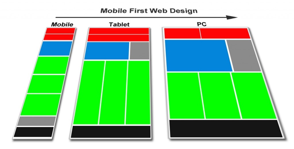
Mobile First Design is simply a design, which starts with a page designed specifically for mobile devices, but, which is responsive and seamlessly displays on PCs and larger screen sizes using a progressive approach.
See the image for an explanation
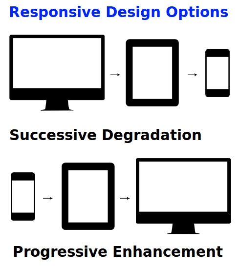
This is the opposite of building pages for PCs and having a responsive system for degrading the content so that it displays on small screens.
However, the mobile first design concepts address much more than the small screen size:
► Speed limitations, Concise Content, Smaller Pages, Less Complexity
► Font size
► Links and click on screen requirements for Mobile Devices
► Optimized Images that render quickly
► Speed maximized by placing the contents of CSS (.css) and Javascript (.js) files within the page, and addressing other limitations to speed. Consider hard copy HTML pages rather content management systems or database systems
► Ads designed for mobile devices
► Concise delivery focused on what users want, answering questions and providing succinct information
These requirements are each discussed below.
Key Elements of a Mobile First Design?
Responsive Design for Rendering on Larger Screens
Responsive design is built around devices and systems that target specific devices and viewport sizes. You can code your initial CSS for a mobile perspective and then use media queries to selectively serve up additional styling as the viewport size increases.
Instead of start big, and then reduce (successive degradation), the opposite method is applied - start small and then expand (progressive enlargement).
Responsive layouts are relatively very easy to do with one-column layouts, but can also work with more columns.
Fast Rendering Speed to Overcome Mobile Device Limitations
Many mobile devices that use Wi-Fi and other broadcast connections, are relatively slow because of the devices' limited computing capabilities and slow internet access. This means that having a fast rendering speed for a web page is critical. It also means that pages have to be smaller and simpler so that they can load faster. Tables, videos and other elements do not work very well on small mobile screens. Images and other elements that can take a long time to load, need to be optimized for speed.
A key element of mobile-first design is that pages have to render very quickly within the constraints of a small screen size (less than 20% or the size of PC Screens, and reduced computing power.
The Google Speed Optimizer Tool provides insight into the page elements that affect render speed. Some of the tips this tool provides are:
- Minify CSS
- Minify HTML
- Minify JavaScript
- Leverage browser caching
- Reduce server response time
- Avoid landing page redirects
- Remove render-blocking JavaScript
- Enable compression for various elements
- Optimize JavaScript and CSS resources by adding the code directly to the page.
- Optimize images with proper formats, lower sizes and the use of compression techniques
A radical suggestion derived from this advice on Speed
Anyone who has used wordpress, content management systems and databases has been plagued with the need for regular updates and load speed problems associated with databases. The speed optimizer tool suggests replacing Javascript (.js) files and CSS (.css) files with the HTML directly added to each page on your site.
The logical next step from this to improve speed is to 'hard-wire' and to 'hard-code' all the content on your pages. Do you really need your content in a database and a system that plugs text from the database into a content management system to render your pages? The alternative is stand-alone HTML pages with all content built-in, using a HTML editor.
Adding a new page can be done by copying your last page, and changing the different elements, such as text and images using the your HTML editor. This means changing the title, description, text in the body, images and layout, by pasting into a copy of an existing page. It is almost as easy to do this via HTML edits, than to enter new elements into a database.
Hard coded pages are blindingly fast. Google loves them and you can include the code you have in js files for css etc. on each page.
Radical perhaps but Google seems to be pushing for that way to go. Once you have published an 'article' you probably won't need to change it. If you do, then it is a simple process of editing the HTML. In some ways this is returning to the way pages were originally developed - pure HTML.
Concise Content, Smaller Pages, Less Complexity, User Centric
A Mobile First approach is minimalistic, both to address load speed limitations, but also because mobile users want simple information to answer their questions or to provide what they want. Instead of starting out with very large and complex design on a PC that has all the bells and whistles, the content needs to be reduced down to the bare essentials. This may mean presenting the full gambit of information on multiple pages. Concise, elegant simplicity is the key focusing on what you know your users want (User Centric).
It requires a smart design that present the information succinctly at the top of the page. Users do not want to scroll endlessly to find what they want or to be required to wade through links.
A good example is a pizza website. Mobile users go to the site to order a pizza and that is what the landing page should do. Users should not have to go to a home page and find a link to the ordering page. You can provide all the information about ingredients, policies, employment on other pages. So, provide what users want up front, 'in your face' concisely and precisely. It is a fundamentally different design concept. The trade-off is that the responsive rendering of the page on PCs with large screens may seem 'under-done', but it will still deliver what users want, and over time, fewer and fewer people will be accessing your site on PCs.
Mobile first design places greater emphasis on delivering what users want, answering questions and providing succinct information. To achieve this, you need to clearly understand your users and what they want. Simply deliver their needs.
Larger font size and styles that suit mobile devices
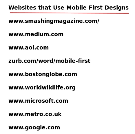
Font sizes, types and styles should be chosen to suit mobile screens. Inevitably, this will mean larger fonts on PC screens as well. This may not necessarily be a disadvantage. A good example of how this can work is the site Medium.
Links and click-on-touch-screen requirements for Mobile Devices
Links and navigation devices need to be designed to operate on mobile devices. This means larger text and more space around the links, less use of menus, and large buttons that are easy to find and click on.
Optimized Images that render quickly
Properly formatted and compressed images can save many bytes of data and can load quicker. There are many software tools that optimize images to display on web pages without the compression compromising how they appear. There are also many ways to use HTML and CSS to set maximum display sizes for images on larger screens, while allowing images to reduce in size to match the screen size.
Use Ads that are designed for mobile devices.
Google offers many responsive ads that display well on small and large screens. These ads are designed for mobiles, but expand on larger screen.
Be Aware of the need to design for multiple screen sizes
You can't design ONLY for mobile devices, as the page may not work very well on larger screens. There are many compromises to consider. Your goal should be to craft an elegant layout that is versatile, efficient and functions well on all viewport sizes, but with mobile screens as the priority.
Reference
A good reference for a case history study of implementing and Mobile first Design is Smashing Magazine
See HTML5 Rocks for further information